Typography is like the meta brand. After color, typography is the second most crucial aspect of a brand —it is the main component of creating verbal language to communicate with your audience and a powerful non-verbal messenger.
It sounds contradictory, but the fact is that the shapes and stylization of your typography say a lot about the tone, atmosphere, and emotions present in your brand. Typography should be chosen strategically, considering not just readability but also thinking, “what else is my typography saying by itself”?
Here are a few key considerations to take in mind when choosing a typeface:
- Think about personality
Ask yourself what the core traits that represent your brand and look for typefaces that visually reflect these. From there, the fonts and styles you use on your website, interfaces, and content should emulate those traits and consistently make your users feel a certain way.
- Reflect on tone
Just as important, the font you choose to represent your brand should harmonize with the tone of your brand’s message. For example, if your brand aims to come across as playful and whimsical, choose a font that is more stylized and decorative.
- Consider functionality & performance
The typography you choose should be functional, legible, readable, and accessible – meaning stray away from overly stylistic fonts that require strain to read and lead your user to click the wrong button. You must also ask yourself if the typeface you choose is web browser compatible, such as Google fonts.
How you use typography and layout is an art form in itself. Many often forget how important typography is in relaying your message and, what’s more, how it paints a picture of your brand’s overall personality and aesthetic.
Valuable tips to keep in mind when choosing the type of typography used in your brand’s message:
- A poor selection of fonts can transmit chaos and push the audience away, while a difficult-to-read font is a significant communication barrier.
- Great typography selection is in tune with the brand messaging and tone —it sets the ground for what the brand wants you to think of it and allows people to connect better with your intentions.
- Serif typography communicates a serious, traditional tone. It can convey elegance, craft, and attention to detail.
- San Serif fonts give a modern look and are ideal when communicating technology, innovation, and straightforwardness.
- Round typefaces are playful, easy-going, and friendly.
- Sharp and angled typefaces speak of speed and go-against-the-tide vibes.
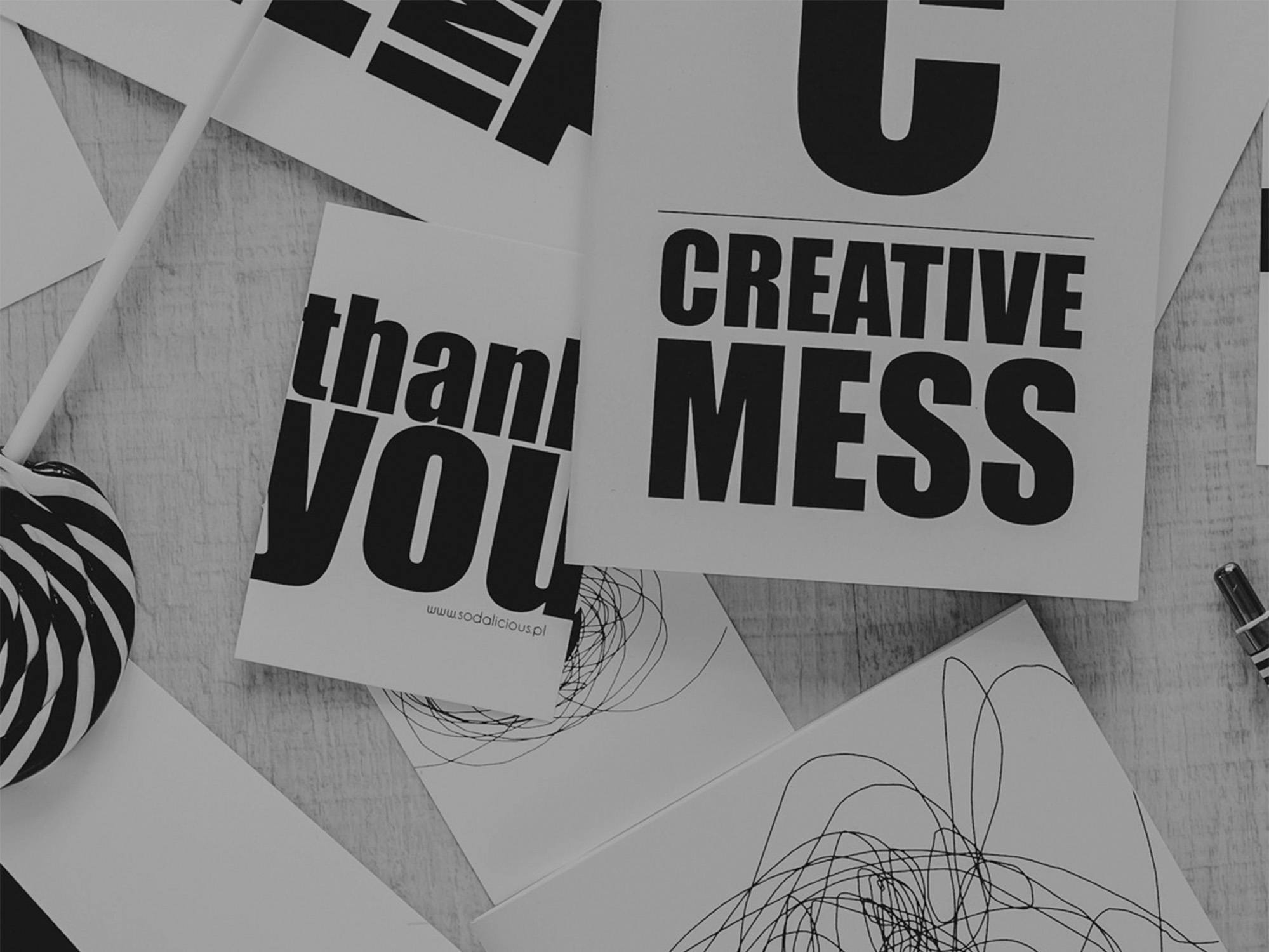
- Distorted typography speaks of contemporary art feels and creates a “break-all-the-rules atmosphere” that is usually used as a design element rather than in actual verbal messaging.
- Thin typography speaks of sophistication and exclusivity.
- Very bold typefaces mean strong character and a firm point of view.
Not only should a designer consider the font style, size, and alignment, but they also must think about the leading used (the space between adjacent lines of type). The designer should also consider the Kerning (the process of adjusting the spacing between characters in a proportional font, usually to achieve a visually pleasing result). Most importantly, the typography you use on your website, and social media content should be straightforward, easy to read, and user-friendly.
In conclusion, choosing the right typeface to represent your brand on your website and social content can be overwhelming. With so many styles and fonts to choose from, the right decision depends on more than just visual aesthetics, the personality you are trying to create for your brand, and its message.
Suppose you’re looking to create a new website, interface, or social content for your brand but don’t know where to start. In that case, our creative team at DuartePino is here to help you take the following steps in creating the perfect brand aesthetic through personalized typography that stays consistent in all of your internal and external communications and content.
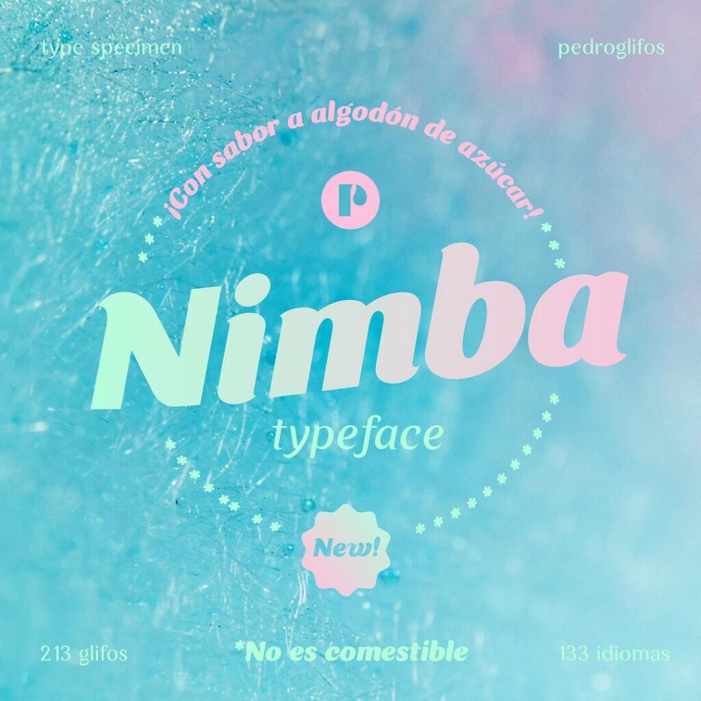
Pedroglifos: Puerto Rico’s first font foundry coming soon
After a 10+ years relationship with typography, Pedro Medina, Lead Creative Advisor at DuartePino, decided the time has come to design his own fonts.
Pedroglifos will be the first font foundry in Puerto Rico with a web page of its own where you can buy fonts and try them out. At the moment, all fonts are created by Pedro, but soon fonts from other Puertorrican typeface designers will be incorporated.
This blog post was written by Miriam Ramos, Junior Creative Advisor at DuartePino.